DO DROPS / Portfolio case study
The edible with all the feels.
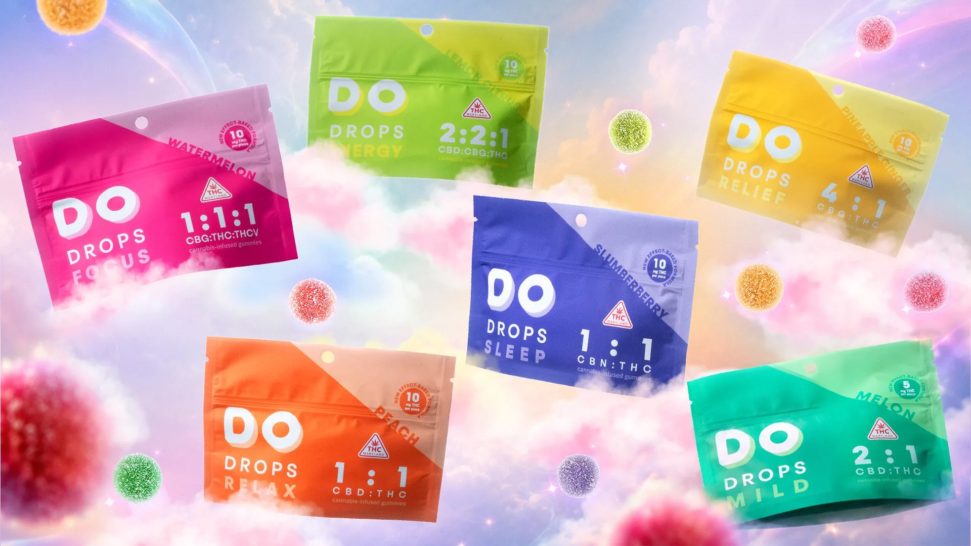
DO DROPS is a mood-led cannabis edible brand designed for distinct moods and moments. The identity translates balanced cannabinoid ratios into a vivid color system, making each effect easy to recognize on shelf. Clear product information meets a modern-mystic sensibility, turning every dose into an expressive ritual.
The central idea
Not just color-coded. Feeling-coded.
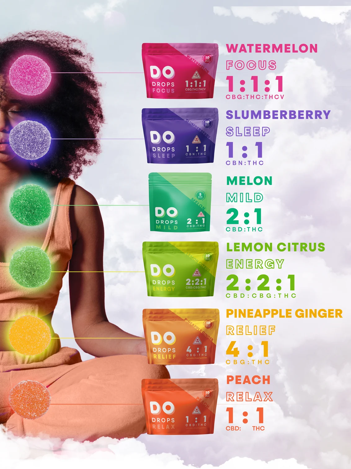
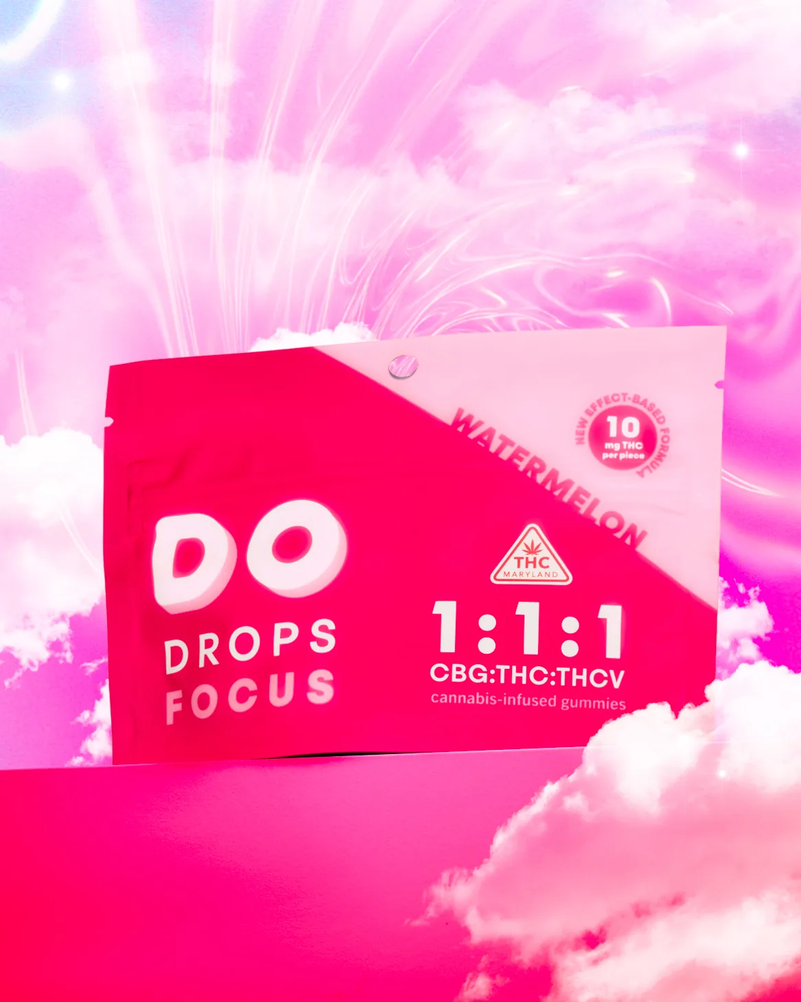
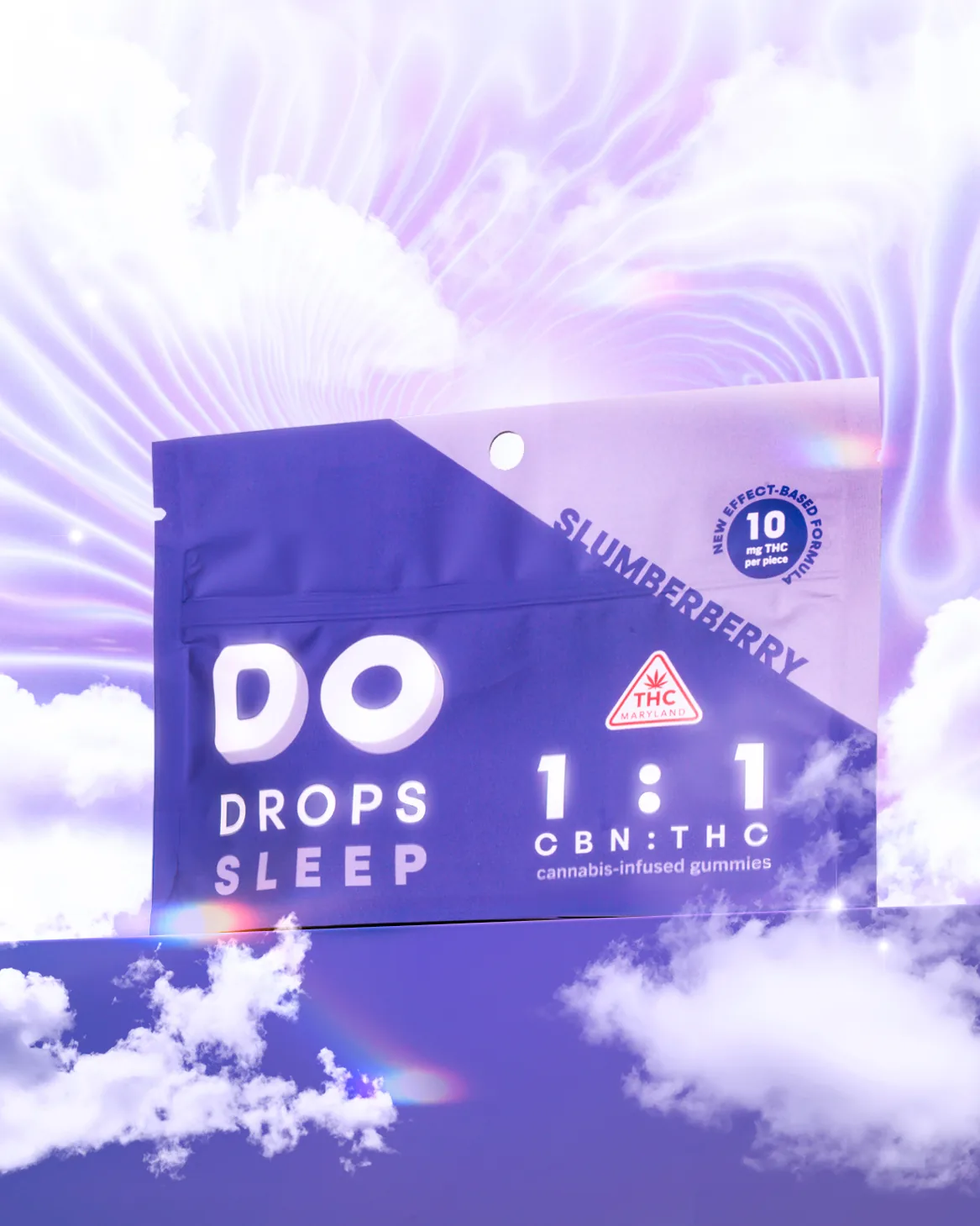
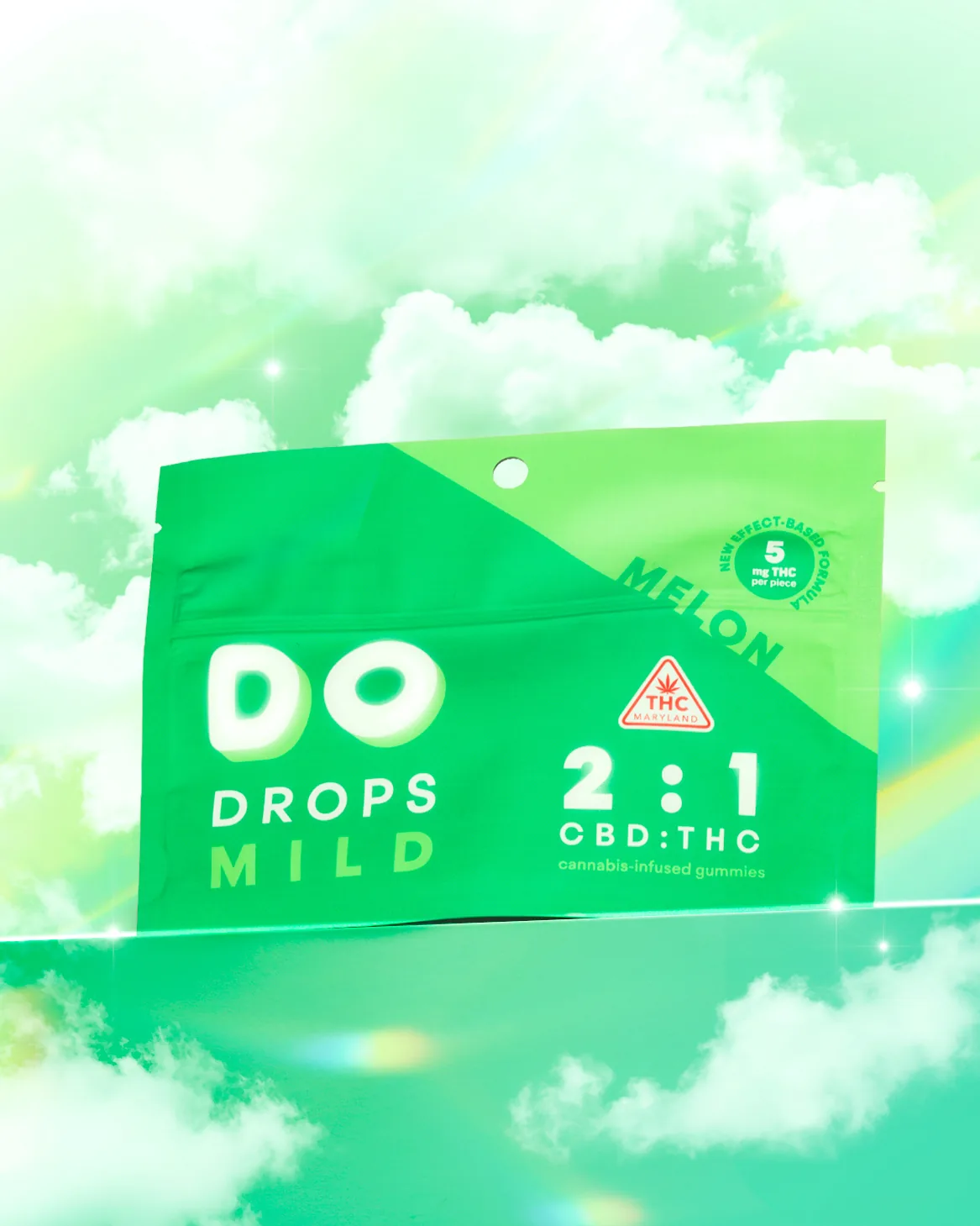
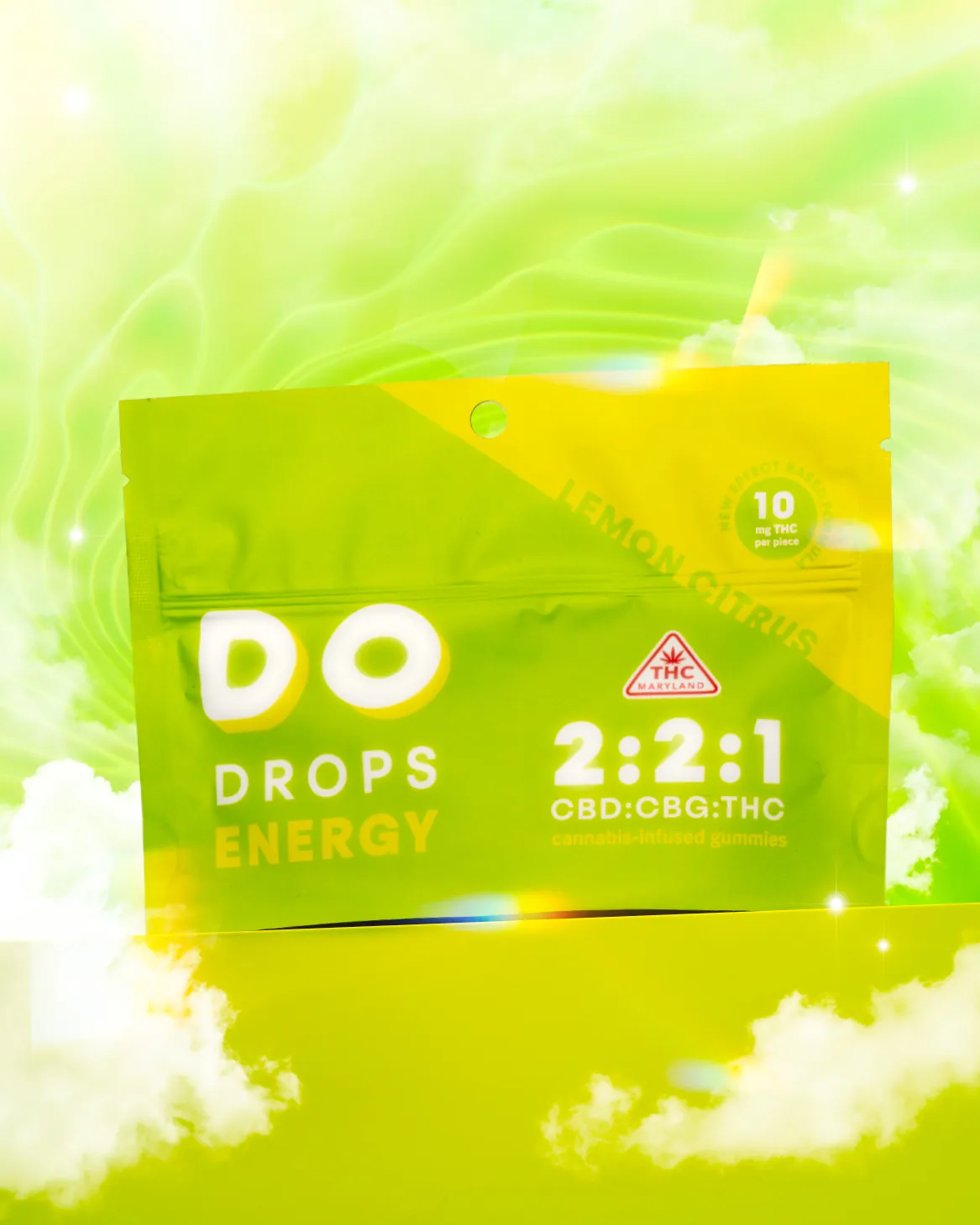
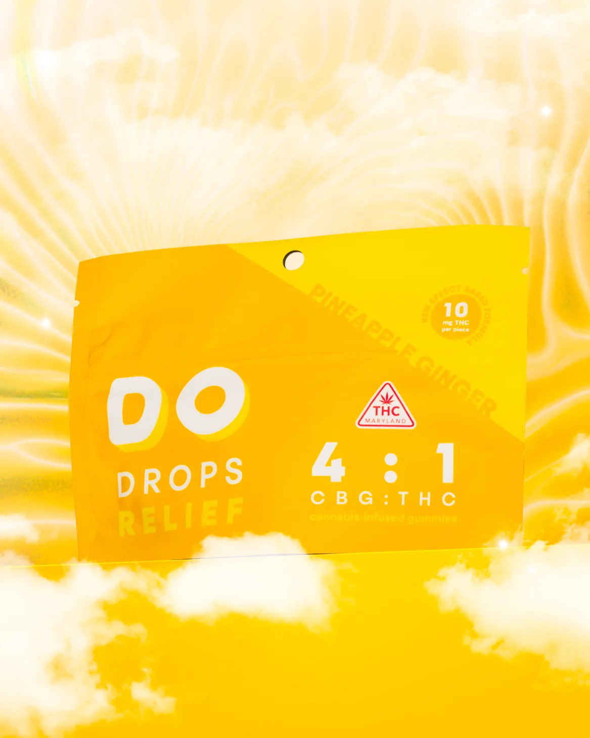
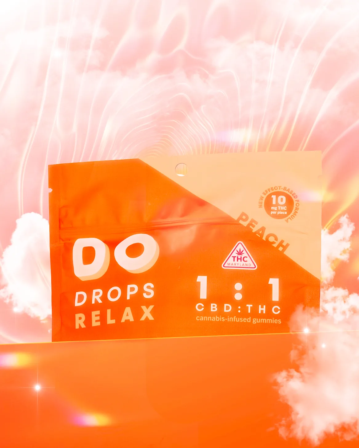
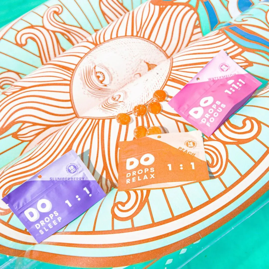
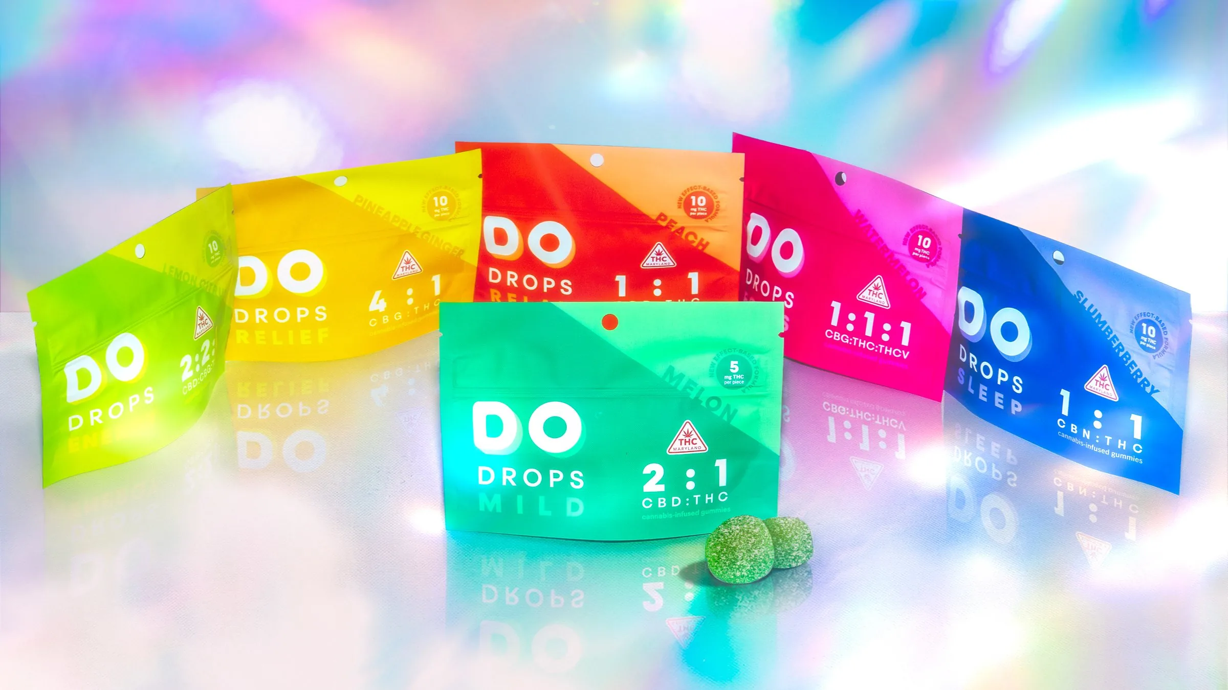
Cannabis packaging often relies on flat, solid color. DO DROPS moves beyond it, giving each intended effect an aura of its own. Gradients, glow, diffusion, and atmospheric depth transform every formula into a luminous mood world, expressing how the experience is meant to feel.
-
 Focus Watermelon
 -
 Sleep Slumberberry
 -
 Mild Melon
 -
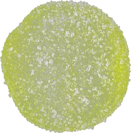 Energy Lemon Citrus
 -
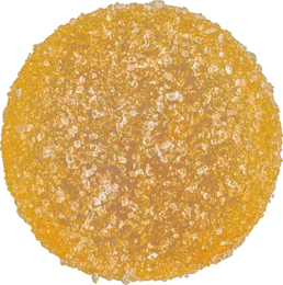 Relief Pineapple Ginger
 -
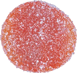 Relax Peach
The modern mystic trend
Modern mysticism offered more than a compelling visual style; it was culturally relevant and naturally aligned with an effect-led brand. Google Trends showed search interest in aura-related terms reaching record highs, reflecting a growing appetite for spirituality, self-expression, and mood-led experiences.
-
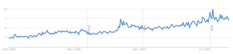
aura
Google Trends, interest over time
-
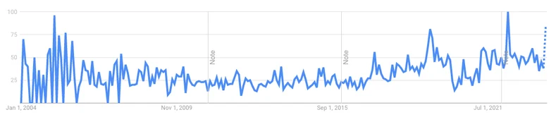
aura photography
Google Trends, interest over time
Visual reference
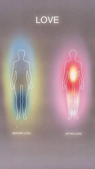
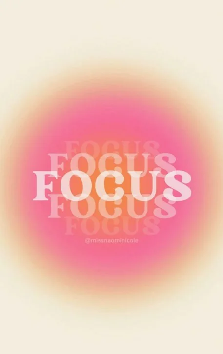
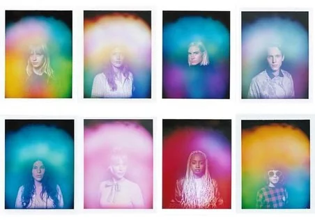

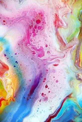
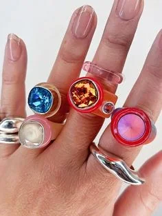
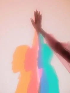
The direction draws from aura photography, gradients, glows, and chakra-like color fields. These cues are refined into a contemporary system: atmospheric enough to communicate feeling, yet structured enough to support a growing product family.
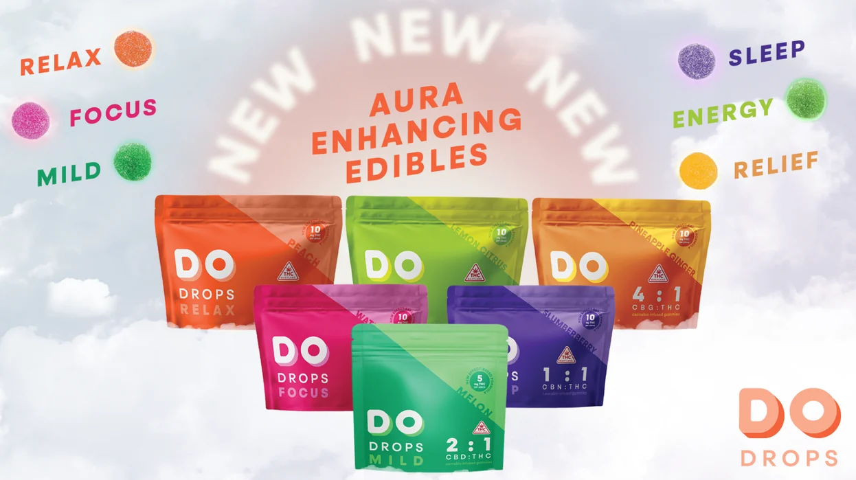


Point-of-sale display
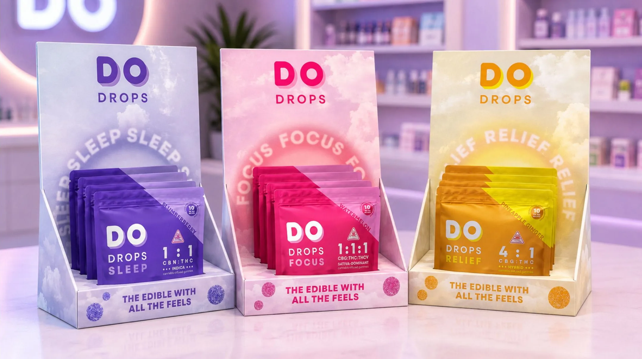
The aura at retail scale
A display system that makes every effect radiate.
Counter displays extend each effect world into the retail environment. Cloud fields, circular type, glowing color, and gummy forms frame the pouch while preserving quick recognition across the family.
Brand in life
From product promise to lived moment.
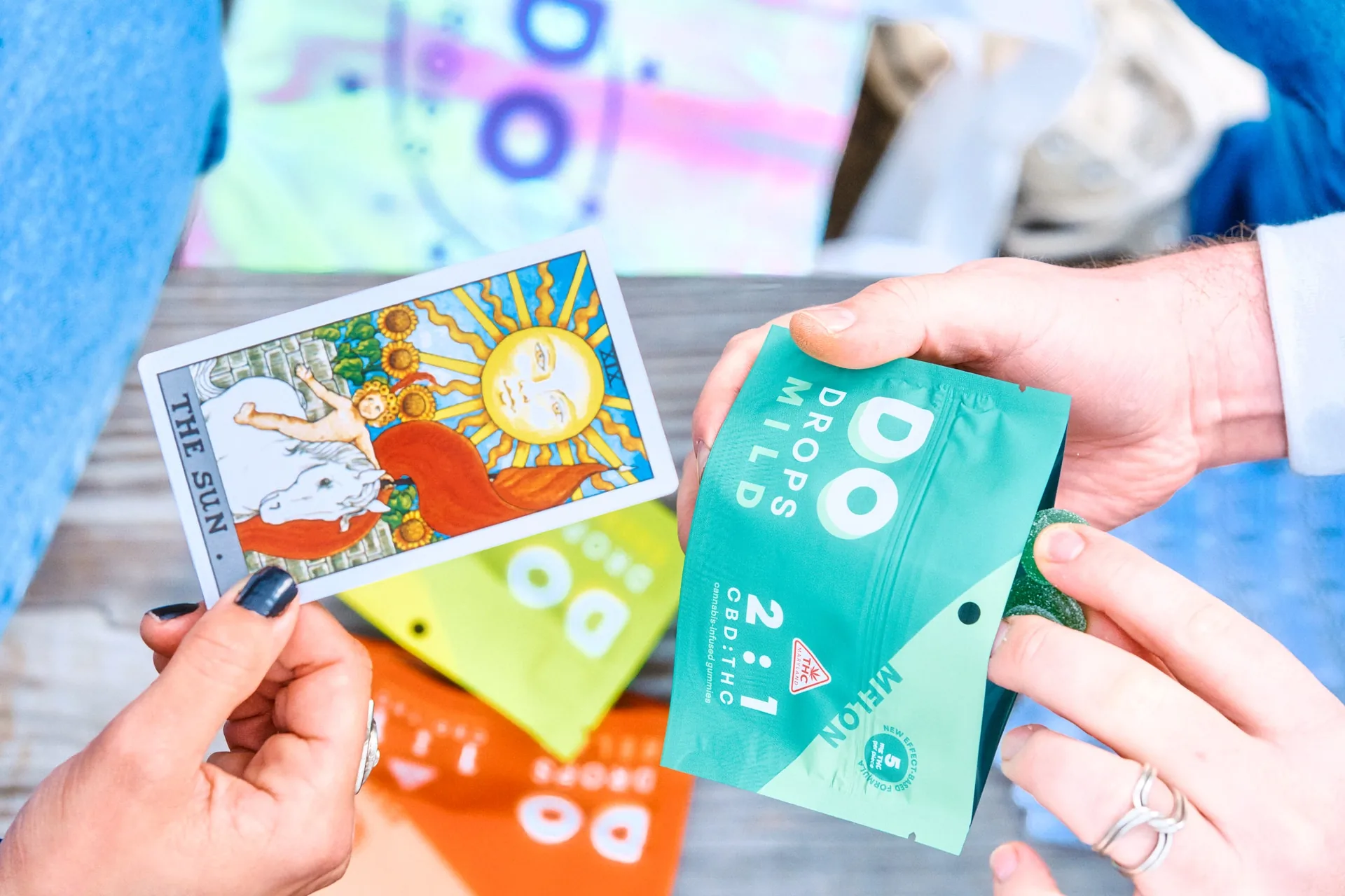
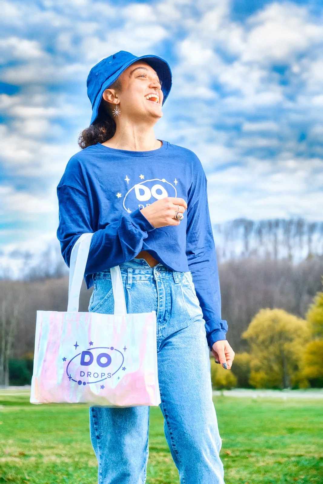
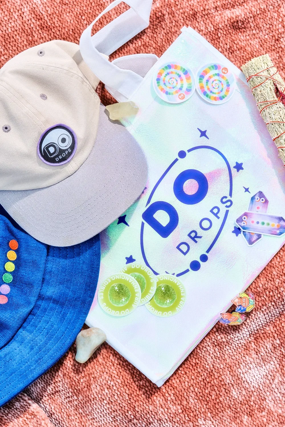
The brand can move from luminous abstraction to real life without losing its point of view. A gummy becomes a small, colorful signal for the mood someone wants to enter.
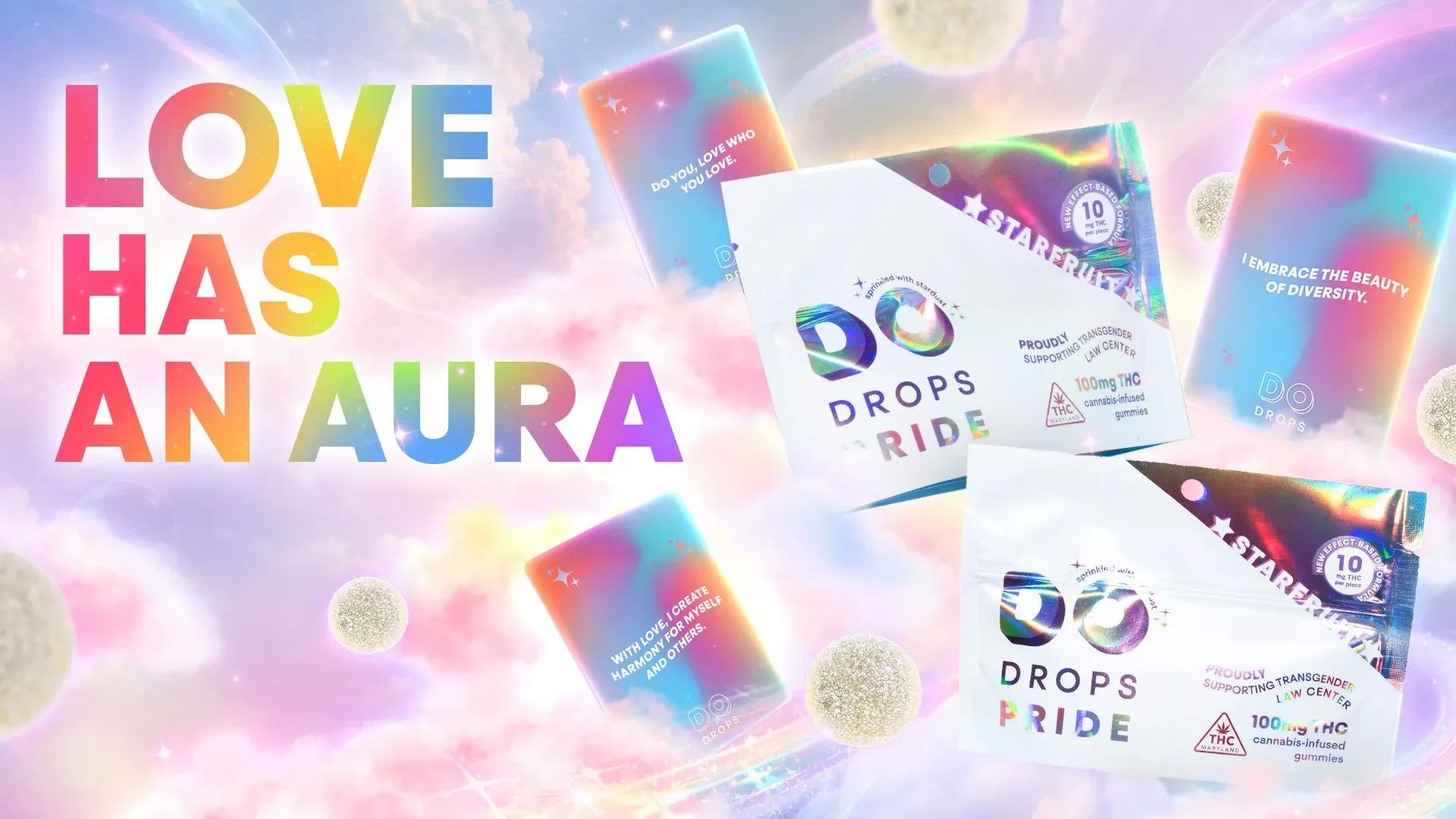
DO DROPS Pride / Maryland
Love and visibility beyond the month of June
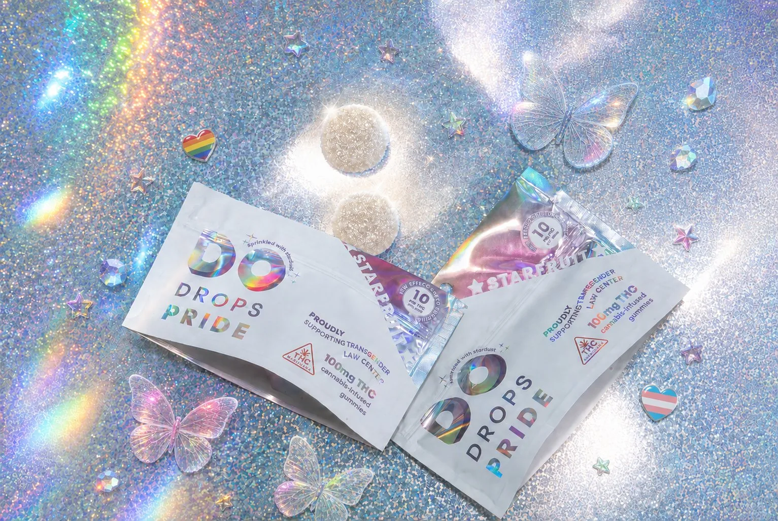
Supporting Transgender Law Center, DO DROPS Pride carried queer and transgender visibility beyond June, affirming the freedom to live authentically, love openly, and be boldly individual.
A glitter-infused gummy and holographic Starfruit pouch brought the message into the product itself. Selective white-ink knockouts revealed flashes of prismatic film, while affirmation cards and launch creative turned every touchpoint into a colorful statement of individuality and pride.
Partner supported
Transgender Law Center
The result
A full spectrum of feeling.
The identity gives DO DROPS something more ownable than a bright palette alone: an emotional visual language. Clear on shelf, atmospheric in campaign, and flexible across effects and flavors.
Back to top