THESTUDIO
THATTURNSYOUR
INTOREALITY

We build brands you can hold. Packaging, product and digital design for consumer goods, taken from first sketch to store shelf.

Scroll to see our work

Recent Work

Brands, with conviction.

Each its own world, built end to end.

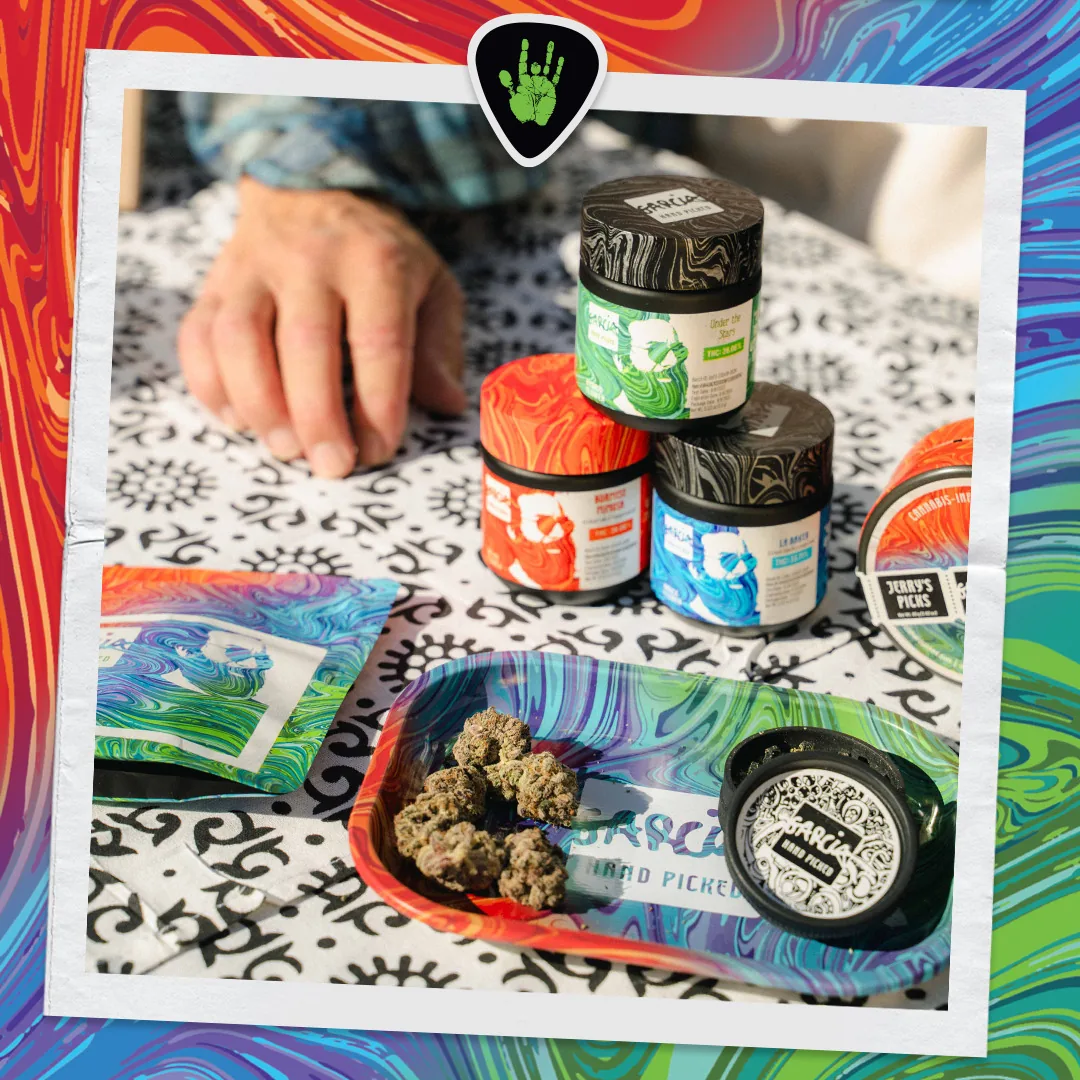
Garcia HandPicked key visual
01
Packaging · Flower / Edibles / Pre-rolls

Garcia HandPicked

Jerry Garcia, officially licensed. The packaging plays like a sixties poster.

Grateful Dead concert-poster energy meets compliant cannabis packaging. Fluid rainbow liquid-marble artwork and an integrated Jerry Garcia portrait carry a deep SKU range and strain-coded variants.

View Case Study
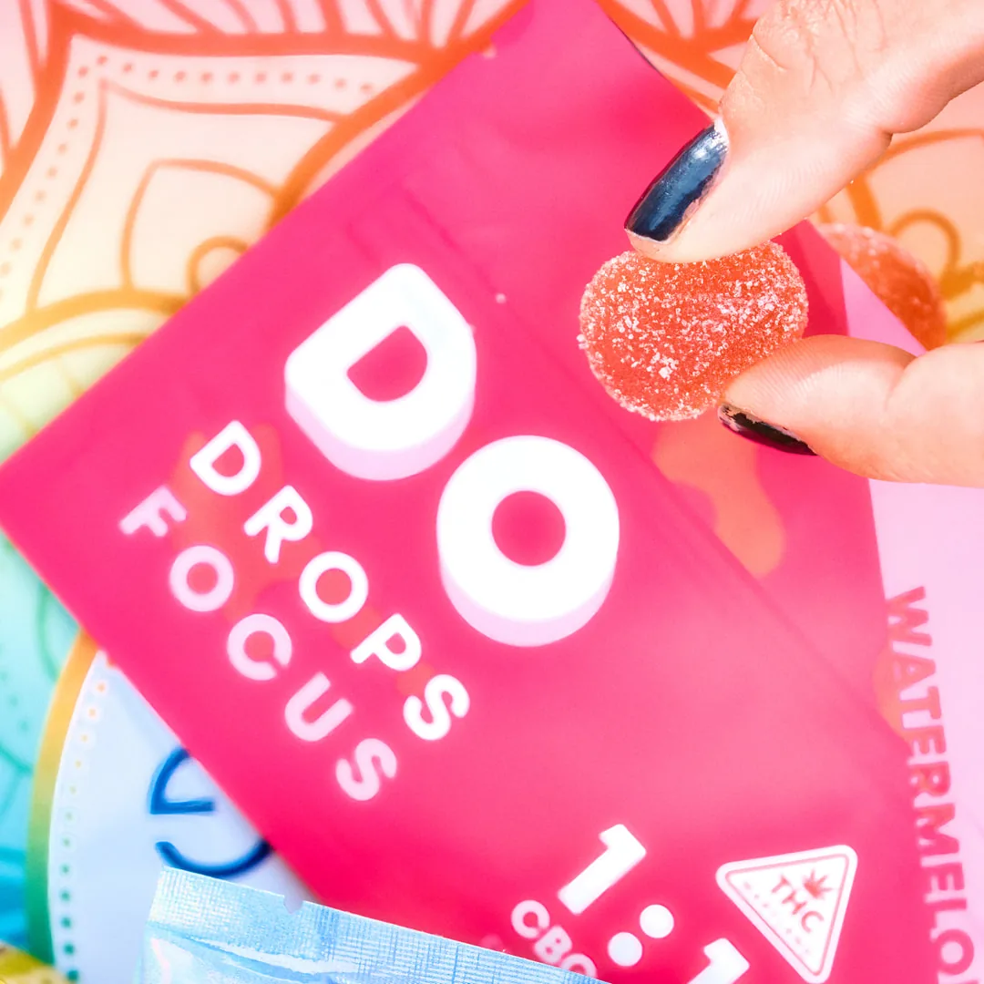
DO Drops key visual
02
Branding · Gummy Pouches & Retail Display

DO Drops

Designed around how you want to feel.

DO DROPS makes choosing the right gummy simple. Each formula has its own bold pouch color, making Focus, Sleep, Relax, Relief, Energy, and Mild easy to recognize at a glance.

Soft aura gradients carry that same playful look into campaign imagery, retail displays, and a Pride edition created with the Transgender Law Center, keeping DO DROPS bright, expressive, and easy to spot wherever it appears.

View Case Study
Strane key visual
03
Branding · Disposable Vapes & Cartridges

Strane

Cannabis vapes with a punk streak: street-art grit meets clean device renders.

A distinctly punk visual system: distressed brick, paint splatter and retro collage against hard acid-yellow-and-black, while premium 3D device renders keep it product-forward.

View Case Study
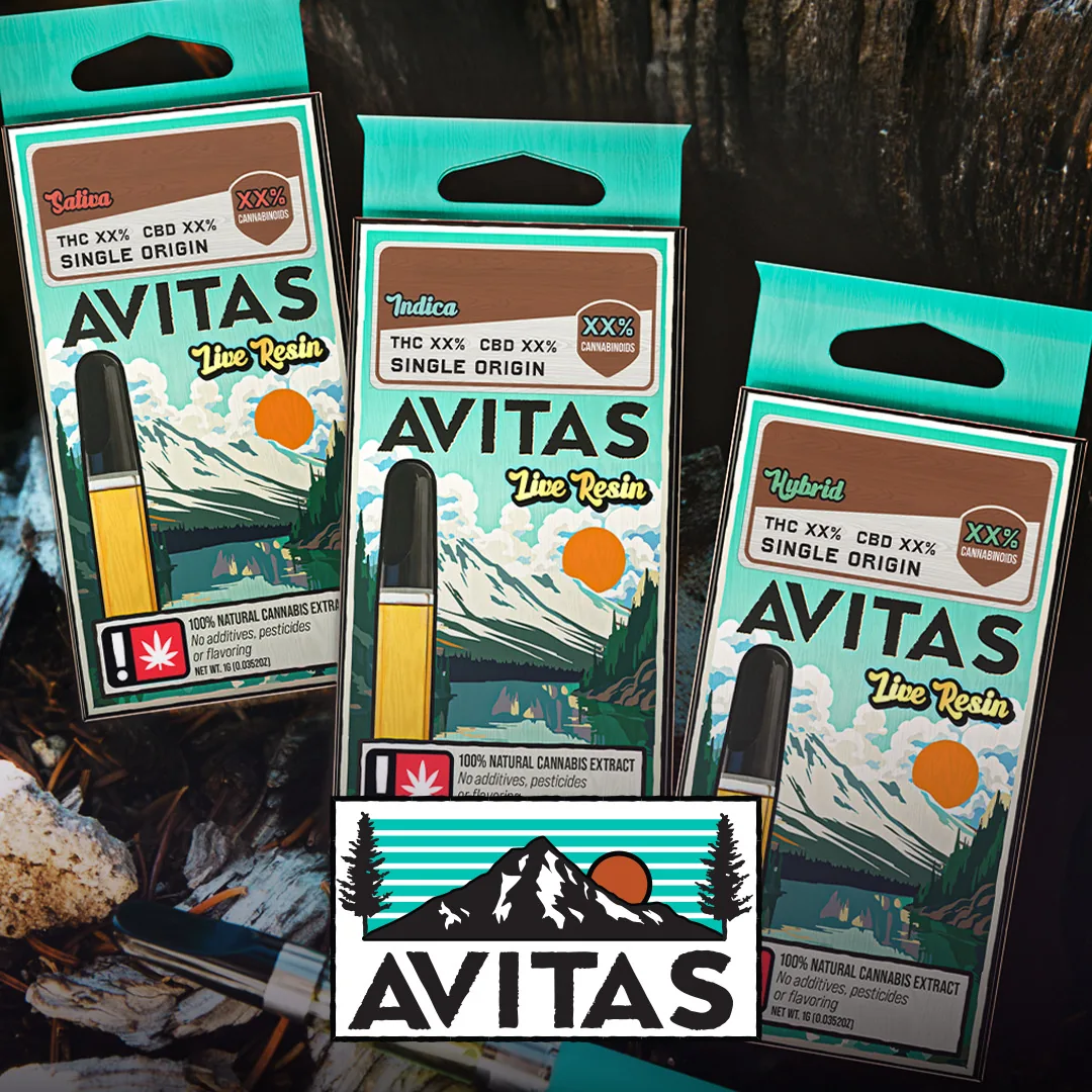
AVITAS key visual
04
Branding · Vape Cartridges & Gummies

AVITAS

Illustrated landscapes carry the identity, one scene per tier.

A full identity system where each tier owns an illustrated landscape: mountains, ocean and botanicals in turquoise-to-navy with gold accents, anchored by a distinctive geometric “A” mark.

View Case Study
Hellavated key visual
05
Packaging · Edibles, Devices & Beverages

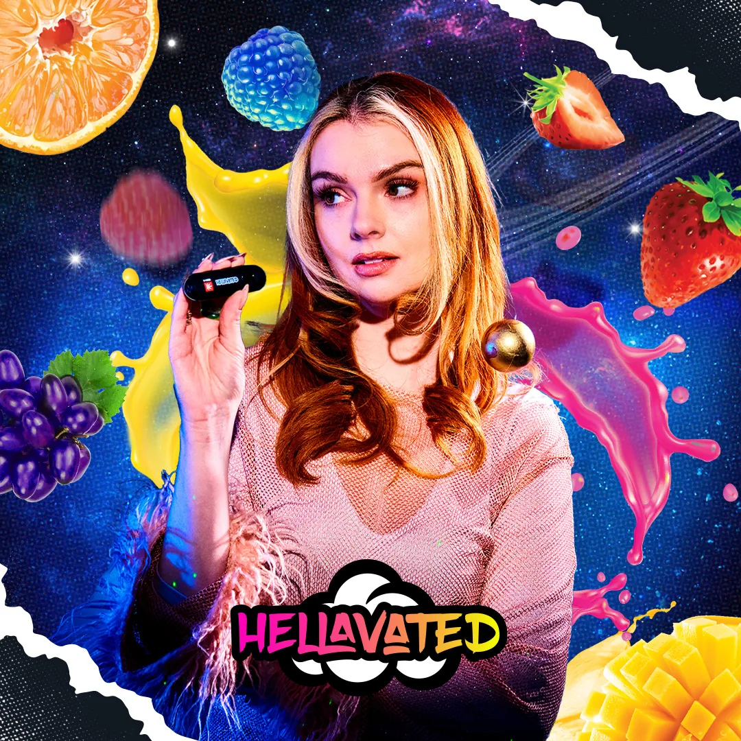
Hellavated

Gen-Z edibles branding, volume all the way up.

Fruit-illustration hero panels meet a black technical compliance side, a two-tone system spanning 18+ gummy flavors, CloudBar vape devices and the Baja beverage line.

View Case Study
Lootbar key visual
06
Packaging · Disposable Vapes & Key Art

Lootbar

Vaporwave flavor system for LightHouse, where every flavor is a loot drop.

Every flavor staged as an open treasure chest with the device floating beside it as the prize, inside one neon HUD frame that recolors across 11 key-arts. Y2K chrome lettering, pixel hearts and arcade checkerboards run throughout.

View Case Study
BETTER key visual
07
Packaging · Cartridges & Gummies

BETTER

An occasion-based cannabis system that colors by time of day: Days, Sleep, Anytime.

Three occasions, three worlds: sunset orange for Sunshine Tangerine days, midnight navy for Midnight Mixed Berry sleep, lavender-and-lemon for Easy Lemon Lavender anytime. Script sub-wordmarks sit under one bold BETTER sans, from blister-carded cartridges to gummy pouches.

View Case Study
Zëife key visual
08
Branding · Soaps & Aromatics

Zëife

A crescent-moon-and-lotus identity for a soap & aromatics house, the studio’s first outside cannabis.

One pink mark, a crescent moon cradling a lotus, set in Pantone-specced moon-dust gray and lotus pink: debossed into black card stock, screened onto shopping bags, framed art-nouveau on business cards. Identity first; the product line comes next.

Case Study Soon
Dougie device
09
Packaging · Infused Blunts & POS

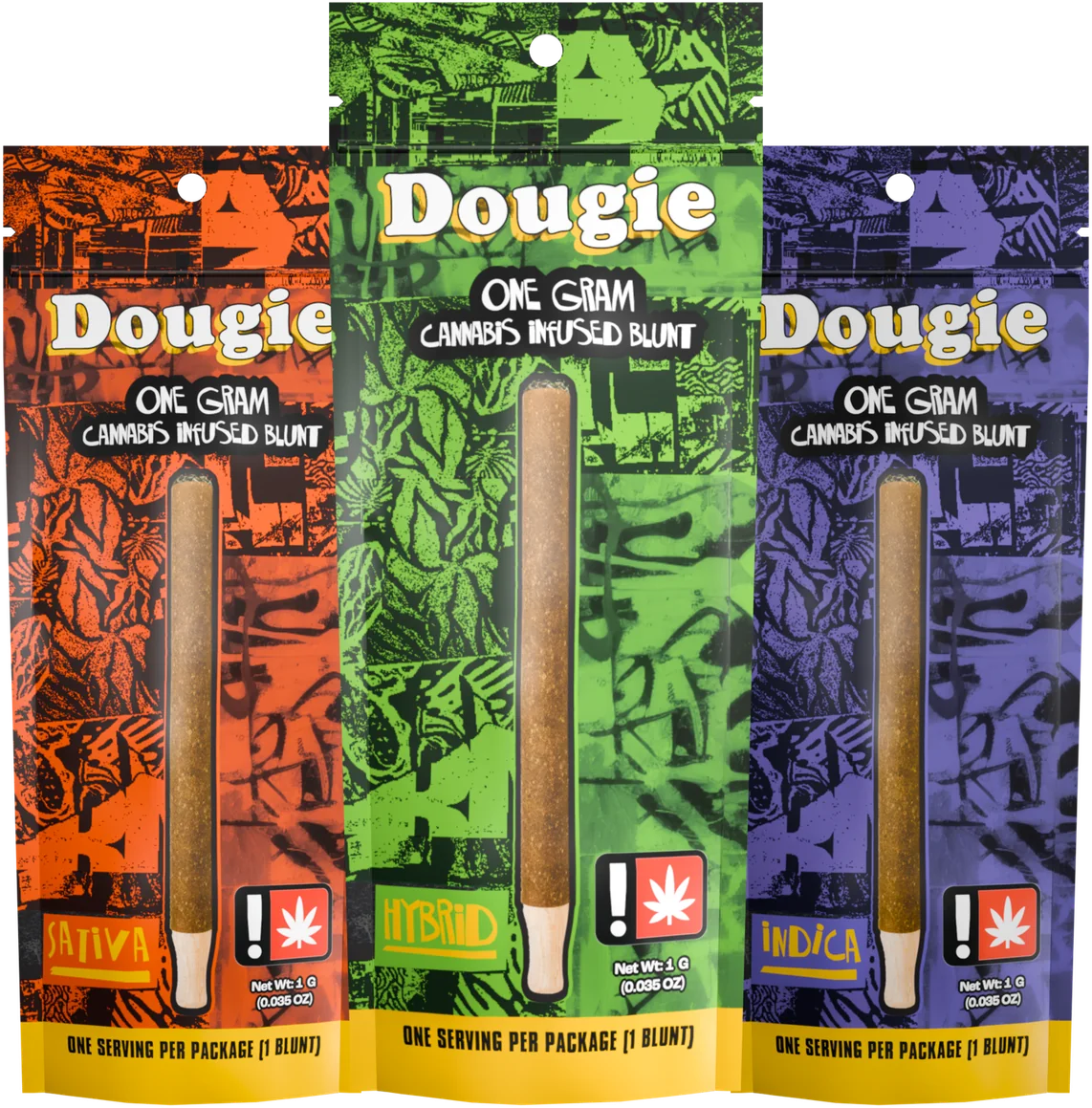
Dougie

Graffiti-wall packaging for cannabis-infused blunts, distributed under LightHouse.

One gold wordmark over a scratched-up graffiti wall that recolors by strain: green for hybrid, purple for indica, orange for sativa, across one-gram and two-gram pouches. A ripped-paper table tent carries the same wall onto the dispensary counter under the line “Make More Mischief.”

Case Study Soon
Ardent key visual
10
Packaging · Infusion & Edibles Kits

Ardent

A kit line where every recipe gets its own color, pattern and hand-painted plate.

Each corrugated mailer tiles the lowercase swirl monogram with the recipe’s own motif: cocoa pods for Mini Truffle Cups, apples for Apple Pie. A textured paper label fronts the box with a watercolor plate of the finished bake, and the wordmark repeats inside the lid. Shown across Apple Pie, Olive Oil, Birthday Cupcakes, Breakfast Cloud Cakes and Mini Truffle Cups.

Case Study Soon
01/10

[  OUR SERVICES  ]

The services
we provide

Identity, product visualization, digital and embedded design, all built as one system. Pick a lane, or hand us the whole brand.

01

BRAND IDENTITY

02

PRODUCT VISUALIZATION

03

WEB & DIGITAL PRESENTATION

04

EMBEDDED DESIGN

[  TRUSTED BY  ]

OUR CLIENTS

[  TESTIMONIALS  ]

WHAT OUR
CLIENTS SAY

"Zegoe transformed our brand identity from the ground up. Their attention to detail and creative vision exceeded every expectation we had."
SC

Sarah Chen

Head of Marketing, BETTER

"Working with Zegoe felt like having an in-house creative team that truly understood our vision. The results speak for themselves."
ML

Marcus Lee

Product Director, LOOT BAR

"The level of craft and polish Zegoe brings to every project is remarkable. They don't just deliver. They elevate."
EV

Elena Voss

Brand Manager, DO DROPS

"From concept to execution, Zegoe delivered a world-class experience. Our engagement metrics increased by 300% after the redesign."
DP

David Park

VP of Digital, HOLISTIC INDUSTRIES

Our Team

Small crew.
Full stack.

Zegoe is four people: art direction, engineering, 3D, and design under one roof. Every project runs direct: the people on this page are the people on your project.

Lenore Hensley

Artistic HeadAtlanta Metro

The taste behind the brands. Lenore sets the creative direction and pushes every concept past safe. If a piece has a signature, it's hers.

Timothy Ton-That

Technical HeadHCM Metro

If it renders, animates, deploys, or has to survive contact with a real browser, it crosses Tim's desk first.

Van Luu

3D SpecialistHCM Metro

Renders, mockups, motion. Van builds the photoreal 3D that makes packaging feel shelf-ready before it exists.

Quynh Nguyen

DesignerHCM Metro

Layout, packaging systems, production design. Quynh turns direction into files that actually ship.

01/04
CONTACT US

[  CONTACT US  ]

Let's talk about your next project.

Doodle Anything to Send

*Just a fun interactive way to say hi. No legally binding contracts here! 😉

Studios

HCM Metro, Vietnam
Atlanta Metro, USA

Contact